- Shehr Yar
- 5 January, 2025
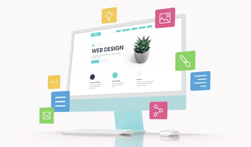
Web design is the process of creating and organizing the visual layout, functionality, and user experience of a website. It combines elements of aesthetics, usability, and technical expertise to develop sites that are visually appealing, easy to navigate, and optimized for performance across various devices. Key components include layout design, color schemes, typography, imagery, and interactive features, all tailored to the brand’s identity and goals. A well-designed website focuses on engaging users, delivering information effectively, and providing an intuitive
Key Aspects of Web Design:
Visual Design:
- Layout: The arrangement of text, images, and buttons to ensure a clean, organized look.
Typography:
Choosing fonts, sizes, and text spacing to improve readability.
- Colors: Selecting a color scheme that aligns with the website’s branding and purpose.
- Graphics and Images: Incorporating visuals to make the website engaging and appealing.
User Experience (UX):
Designing websites that are easy to navigate.
Ensuring content is logically structured to guide users smoothly through the website.
Responsiveness:
Creating websites that adapt to different screen sizes, from desktops to mobile devices.
Functionality:
Integrating interactive features like menus, buttons, forms, and other elements.
Ensuring these elements are fully functional and user-friendly.
Accessibility:
Designing for inclusivity, ensuring people with disabilities can easily navigate and interact with the site.
SEO Optimization:
Structuring the site and content to improve search engine rankings and online visibility.
Tools & Technologies:
Web designers often use tools like:
- Graphic Design Software: Photoshop, Figma, Sketch.
- Web Design Platforms: WordPress, Webflow, Elementor.
- Code Editors: HTML, CSS, JavaScript for customizations.
Importance of Web Design:
A well-designed website:
- Attracts Visitors: Captures attention and encourages users to stay longer.
- Builds Trust: Establishes credibility and professionalism.
- Enhances Branding: Reflects the identity and goals of the brand or business.
- Improves Conversions: Drives user engagement and actions, such as purchases or sign-ups.
Web design combines creativity with technical expertise, aiming to balance beauty and function for effective online communication.
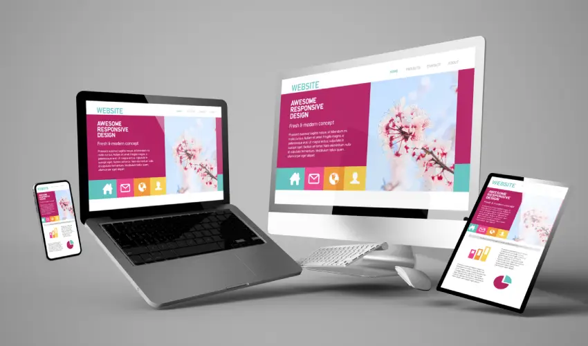
What is Responsive Web Design?
Responsive Web Design is an approach to web development that ensures a website’s layout and content automatically adapt to different screen sizes and devices. This technique allows users to experience a seamless and optimized viewing experience, whether they access the website from a desktop computer, tablet, or smartphone.
Key Features of Responsive Web Design:
Flexible Layouts:
- Uses a grid system with fluid measurements (percentages) instead of fixed dimensions (pixels) to allow elements to resize dynamically.
Responsive Images and Media:
- Images, videos, and other media scale proportionally or load differently based on the screen size.
Media Queries:
- A CSS feature that applies specific styles based on the characteristics of the user’s device, such as screen width, resolution, and orientation.
Mobile-First Design:
- Designing primarily for mobile devices and then scaling up for larger screens ensures a more focused and user-friendly experience.
Benefits of Responsive Web Design:
Improved User Experience:
- Content and design adjust seamlessly, enhancing readability and navigation.
Cost-Efficient:
- Eliminates the need to create and maintain multiple versions of the same website for different devices.
Better SEO Rankings:
- Search engines like Google prioritize mobile-friendly sites, improving visibility and rankings.
Increased Reach:
- Makes your website accessible to a broader audience, including users on smartphones and tablets.
Future-Proofing:
- Prepares your website for new devices and screen sizes as technology evolves.
How It Works:
Responsive web design relies on:
- Fluid Grids: Proportional rather than fixed-width layout structures.
- Flexible Media: Ensures media elements scale appropriately within containers.
- Breakpoints: Defined points in CSS where the design adjusts to provide the best layout for the current screen size.
Latest Custom Web Design Projects

Related Post